Graphic Designer
INDDAY
(Branding Design)
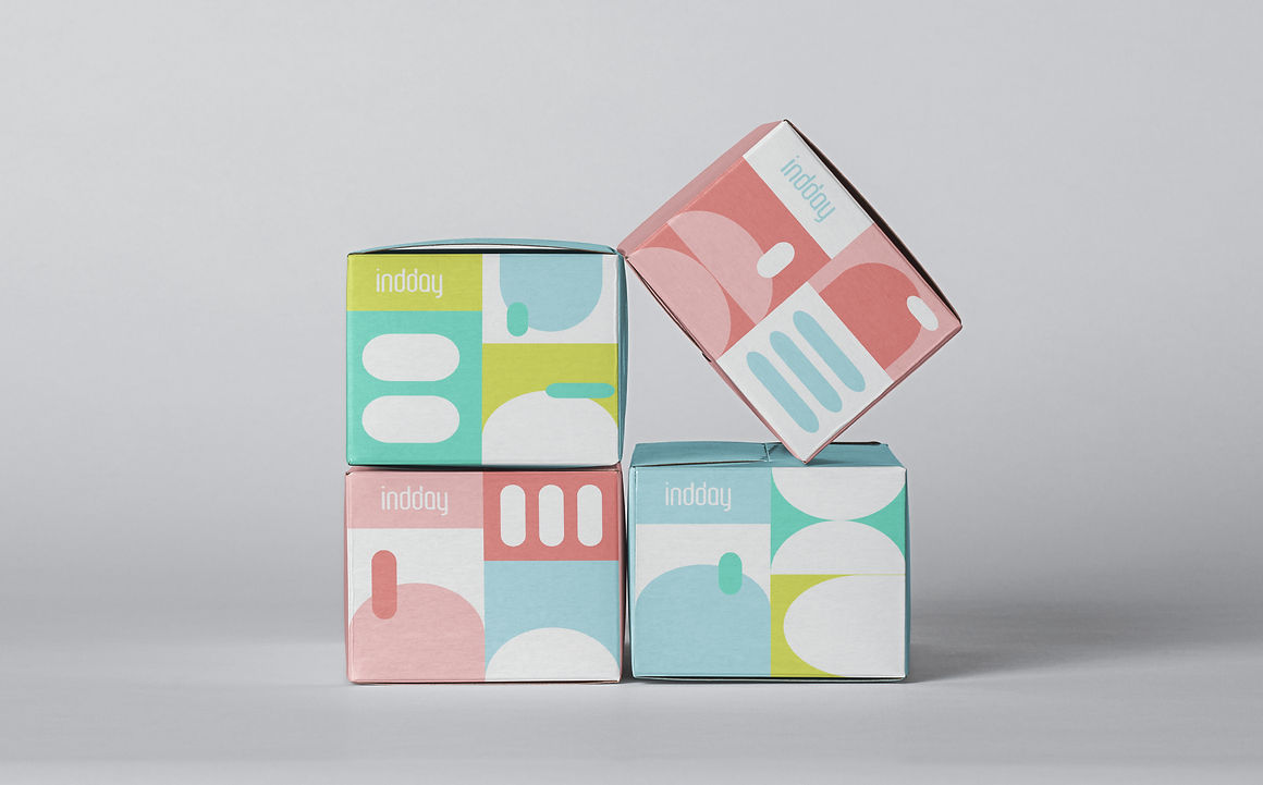
The idea for the 'indday' brand was born from my personal aversion to taking medicine during the outbreak of COVID-19. From a young age, I have always associated medication with negative feelings such as fear, discomfort, and bitterness. In response, I aimed to create a children's medicine brand that would make the process of taking medication more pleasant. To achieve this goal, I incorporated vibrant colors, appealing packaging, and interactive elements into the brand design, hoping to create a more enjoyable experience for children.
The brand name, "indday," stands for "in a good day," reflecting the brand's positive aspirations for children.

To create a friendly logo for my brand, I opted for lowercase letters, as they convey a welcoming tone compared to uppercase letters. Additionally, I ensured that the logo graphics were rounded to give off a non-threatening vibe. The brand name, "indday," stands for "in a good day," reflecting the brand's positive aspirations for children. I also chose a calming candy color palette to make the brand more approachable and less intimidating, given its association with pharmaceuticals. This decision aims to create a more amicable and child-friendly brand image.
.jpg)

Based on the logo, I created various miscellaneous shapes and patterns as the second focal point of the entire brand, in addition to the logo.


Based on the previous elements, I made some print materials such as business cards, posters, brochures, stickers, tapes, etc.


Medical related product packaging design:
Medicine Box


Masks


Daily medication check-in stickers (obtain rewards based on stickers, improve children's motivation for taking medicine)

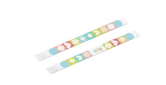
Hospital bracelet

Calendar Blind Pill Box (vitamins with different flavors, increasing the interactivity and fun of taking medicine)

Dispensing bag

Employee ID card

Store and company exterior decoration design


Finally, I also designed the brand's app, which is categorized into four areas: home, consult, science, and profile. The app provides several features, including the ability to schedule a consultation with a doctor, purchase medicines, and gain knowledge about children's diseases. The app's design style is consistent with the previous branding style, emphasizing a friendly and approachable theme.


Finally, this is a video showing the software interaction.
